


On , the Sutro Baths were opened to the public as the world's largest indoor swimming pool establishment.
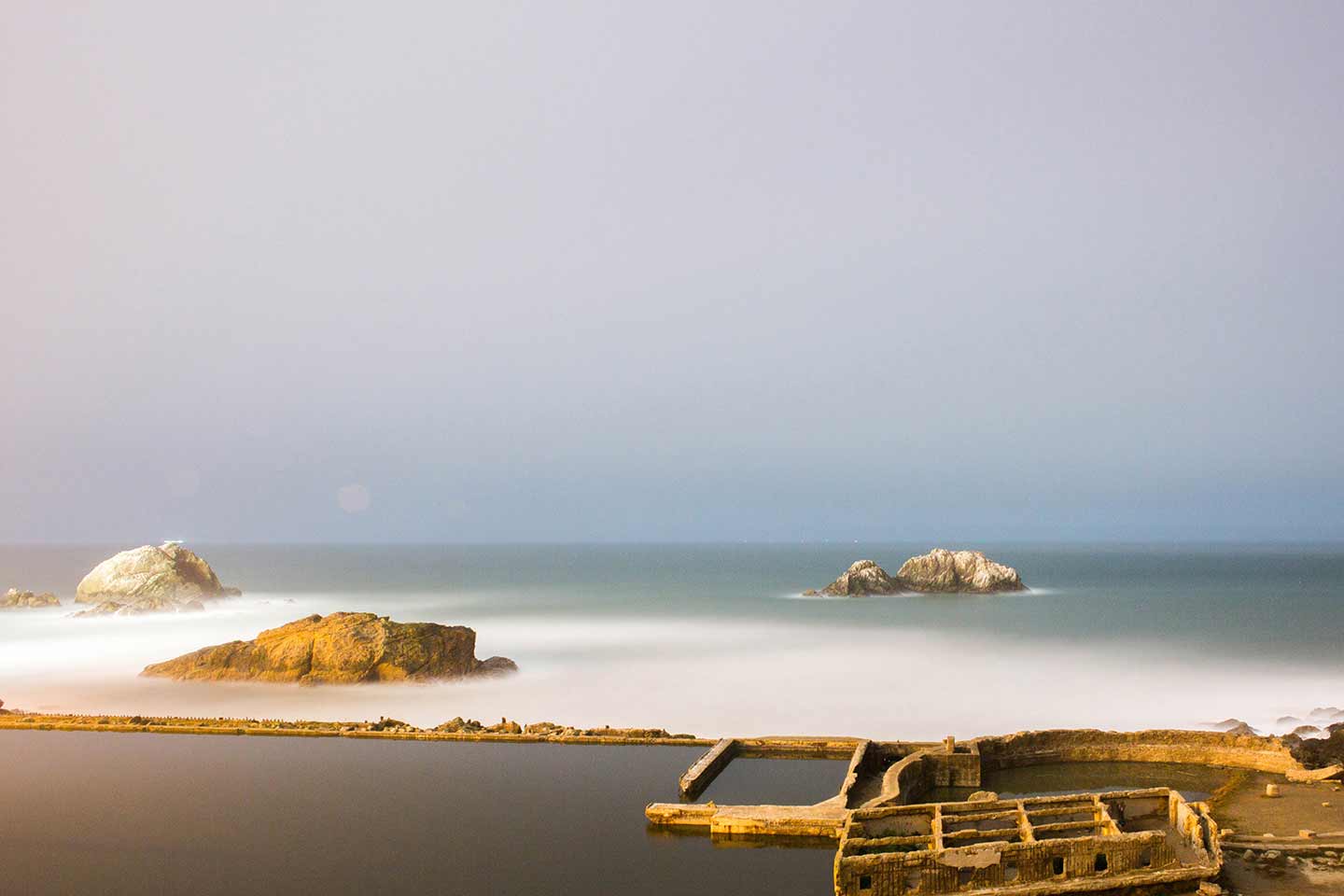
Before it burned to the ground, the structure filled a small beach inlet below the Cliff House, also owned by Adolph Sutro at the time. Shortly after closing, a fire in 1966 destroyed the building while it was in the process of being demolished. All that remains of the site are concrete walls, blocked off stairs and passageways, and a tunnel with a deep crevice in the middle. The cause of the fire was arson. Shortly afterwards, the developer left San Francisco and claimed insurance money.
During high tides, water would flow directly into the pools from the nearby ocean, recycling the two million US gallons of water in about an hour.
During low tides, a powerful turbine water pump, built inside a cave at sea level, could be switched on from a control room and could fill the tanks at a rate of 6,000 US gallons a minute, recycling all the water in five hours.


Perfect typography depends on perfect harmony between all of its elements. Harmony is determined by relationships or proportions. Proportions are hidden everywhere. words themselves.
True book design, therefore, is a matter of tact (tempo, rhythm, touch) alone. It flows from something rarely appreciated today: good taste. The book designer strives for perfection; yet every perfect thing lives somewhere in the neighborhood of dullness and is frequently mistaken for it by the insensitive. In a time that hungers for tangible novelties, dull perfection holds no advertising value at all.
In a masterpiece of typography, the artist's signature has been eliminated. What some may praise as personal styles are in reality small and empty peculiarities, frequently damaging, that masquerade as innovations.
Only through constant practice and strictest self-criticism may we develop a sense for a perfect piece of work. Unfortunately, most seem content with a middling performance. Careful spacing of words and the correct spacing of capital letters appear to be unknown or unimportant to some typesetters, yet for him who investigates, the correct rules are not difficult to discover.